Business Cards Re-revisited
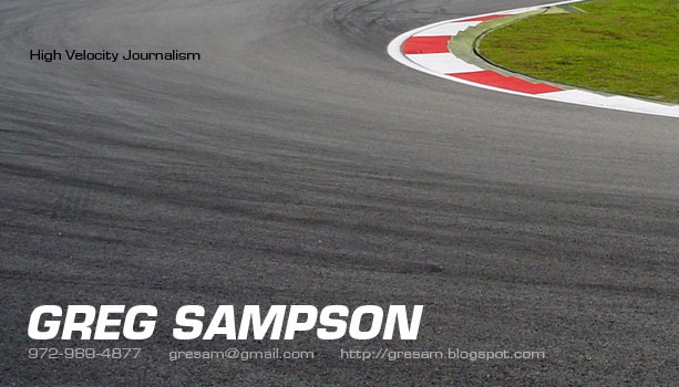 Well, I'm really liking this design. The font is easy to read, the purpose seems more clear cut and the imagery is perfect. I'm super pleased with the work Jon has done on the card, he seemed to know exactly what I was seeking as soon as we started talking about it, and things came together pretty quickly.
For most people I think they only consider this a business card. For me, however, this is branding and establishing my image so I need to be sure that I'm getting a creative product that will be memorable and make an impression. If I hand this card to someone in the paddock and ask to speak with them in the future, I'm sure they will remember me. Same goes for magazine editors or anyone I might contact via post, or of course other people/photographers/writers at races.
posted by GreSam @ 10:17
![]()
![]()


1 Your Opinion:
I think this looks great.
I would do a test run to make sure the contact info and "low gear typist" or whatever it says in the top left are easy to read. Since this on the screen and not on paper, i am not sure what the results will be...
since you will be passing these out in europe, your phone number might be better as +1 xxx.xxx.xxxx
i am excited... i wish i could head that way soon...
Post a Comment
<< Home